- Tiferet Shish
- Dec 26, 2022
- 4 min read

Updated: Dec 4, 2023

Well, to be honest, the reactions to part one of the post were extraordinary! I received countless enthusiastic, excited, and mainly exuberant emails. I was glad to see (or more precisely, read) that you liked the post and found inspiration in the photos.
One thing that really got you, perhaps beyond my expectations, was the original photo I attached to the previous email. As you recall, I asked each of you to process it according to your own imagination. I requested you to step out of the box and do whatever you wanted with it. You sent me numerous processed images, and some even included several sketches for the same photo. Well done! What dedication!
Indeed, I saw beautiful and impressive edits. However, truth be told, almost all of them were quite similar. Sure, some leaned towards a greenish tint, others played with a slightly sepia tone, and so on. The vast majority, though, edited the photo in shades of orange.
I know it's a summer photo, and some of you even mentioned that in your emails, but there's one thing you forgot!
Just as every winter day leads to summer, every day's end leads to night...
Yes, I understand that for a regular shot, I might warm up the color tones, but here I asked and emphasized the desire to step out of the box and process something different according to your creativity!
And why did I write all this?
Because it comes from personal experience with this particular photo!
As I mentioned to you (in the previous post), I worked on this photo with countless sketches, experiments, and repeated processing attempts. Still, I couldn't reach a point where I felt I had brought out its maximum potential. I knew there was more, but I didn't know which direction to turn.
As you told me, the photo is a vivid image of summer; there's no confusion here!
The girls are dressed in stylish summer outfits, enjoying ice cream and relishing every moment. This calls for a warm summer edit! Therefore, it cannot be turned into a regular, dramatic blue edit because the girls are laughing and having a good time! It doesn't suit the mood. And, of course, not a cool edit with rain and so on... because it's hot! And the photo screams it :)
But a regular, warm photo did not satisfy me in this specific session, even though it was very professional, and I went through all possible editing stages.
(On the other hand, in the session where the girls are dancing, playing, and enjoying themselves, I did a warm edit and was satisfied, thank God.)
And here is the photo from the previous sketch:

So, then the idea struck me to add something small, really tiny but immensely meaningful. Something that would change the entire meaning of the photo for me but still keep it lively and pleasant.
The moon. Yes, that's the element I added, and it's the one that altered the meaning of the photo for me, taking it in a different direction and to other realms.
So, here is the photo presented before you:

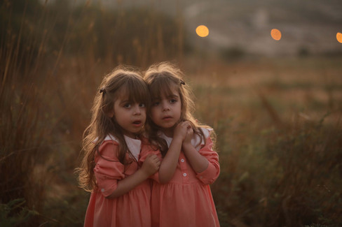
Alright, so I finished with the photo above, and I was pleased with it. Thank God, I worked on another image from the set. Then I moved on to a set of photos with a very princess-like and sweet atmosphere, taken right at dusk, on the edge of darkness, and I started editing.
Honestly? The editing was quite easy and flowed smoothly. It took just a few minutes. But something about the final harmony didn't sit well with me. Something about the colors simply didn't appeal to me. Maybe I'm wrong, or perhaps it's just a matter of taste. But the moment I changed the color of the dresses from peachy pink to olive green, my opinion settled (;

Well, here is the photo. In my eyes, it's amazing. But can you imagine that it's a successful combination of two photos together?


You're asking me?
Firstly, I'm not really a fan of combinations. Why work hard? Just take a photo, and that's it! But when it's necessary, it's necessary. Sometimes when I'm capturing multiple figures together, especially when they are already tired and exhausted, I won't insist on the perfect photo and demand a smile from everyone because it's not going to happen, and the sun is just going to set. What I do try is to have as many subjects (if it's a family) looking photogenic and good as possible. If one or two didn't exactly look or cooperate, it's easier to blend them in during editing than to tire them out and demand a perfect shot. Of course, it's essential to make sure I have another photo from the same session with the exact location, and the child stands in the same place for the photo I want to integrate, and there they will look good.
Also, another crucial tip! I never blend specific body parts like eyes, mouth, or even a whole face. The combination will only occur in parts where the connection between them is not noticeable, like clothing, accessories, and the background.
And now, what exactly do you like? A video edit with another fantastic tip that will upgrade your photo and provide you with new and interesting perspectives you may not have thought about.

Enjoyed the post? I'd love to hear (:


Comments